Keyword Tool is an SEO platform used by marketers to discover keywords and analyze search data. As the product grew, more features were added — but the experience didn't evolve with it.
Too many tools without clear structure. An overloaded interface. Navigation that made users work harder than the task itself. People were spending more time figuring out the product than actually using it.
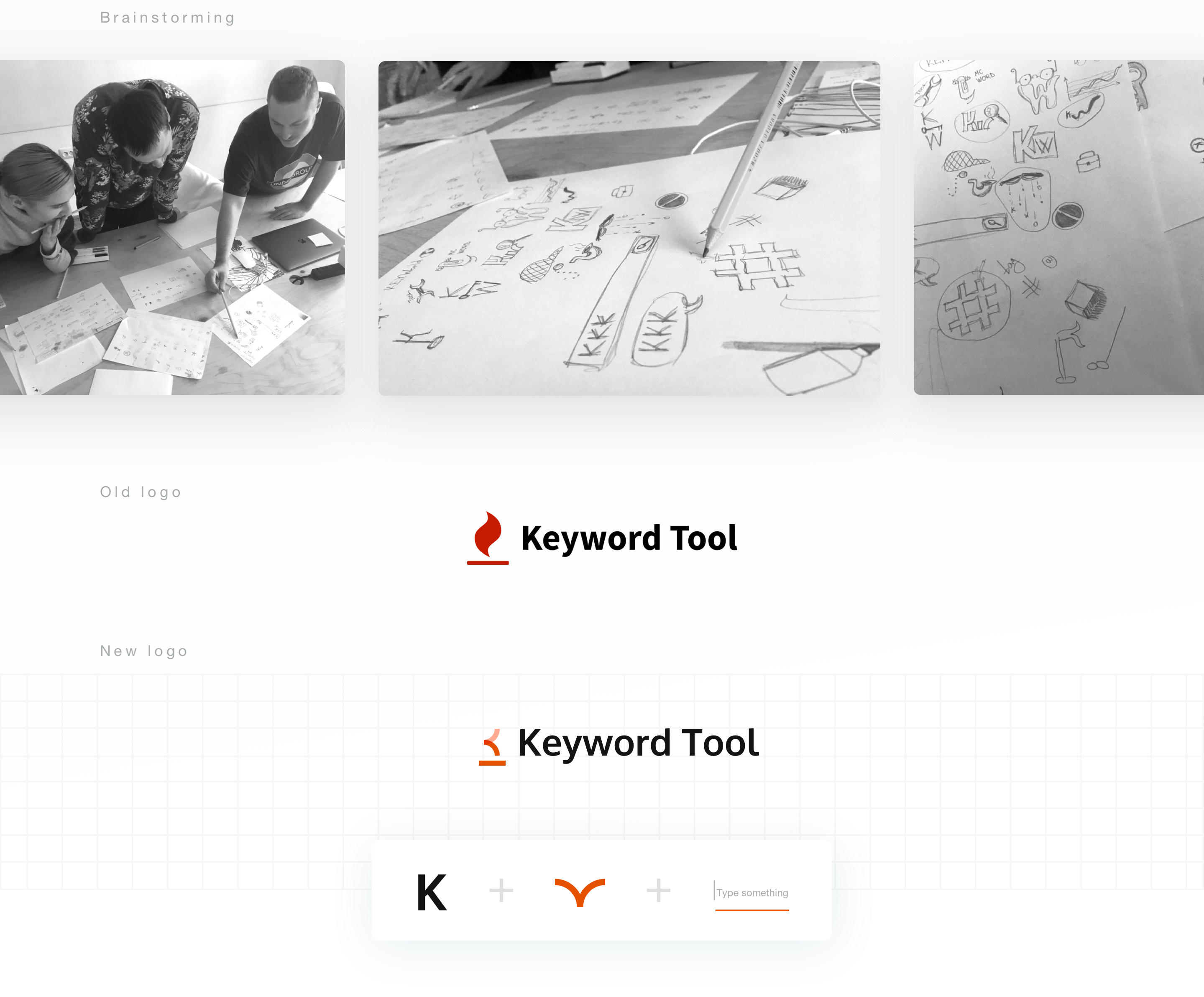
The issue wasn't the number of features. It was the lack of clarity.
When everything is equally visible, nothing feels important. The product wasn't broken — it was just impossible to scan. Every screen competed for attention, and users had no signal to tell them where to start or what mattered.
Make complexity feel simple.
Not by removing features — but by giving them structure. The goal was a product where the right thing is always obvious: the right tool, the right action, the right next step. Calm, focused, direct.
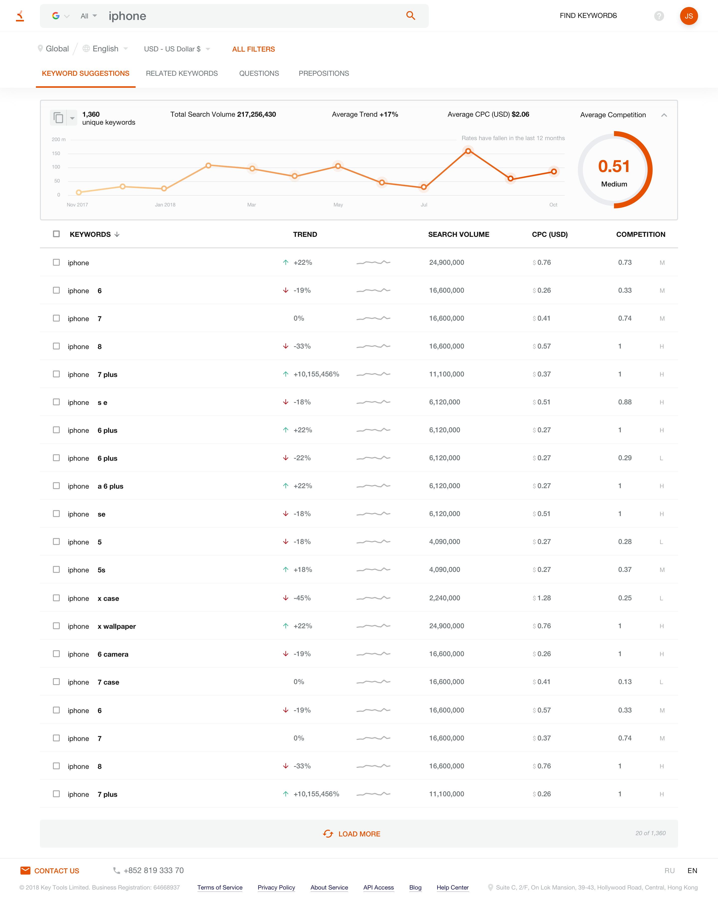
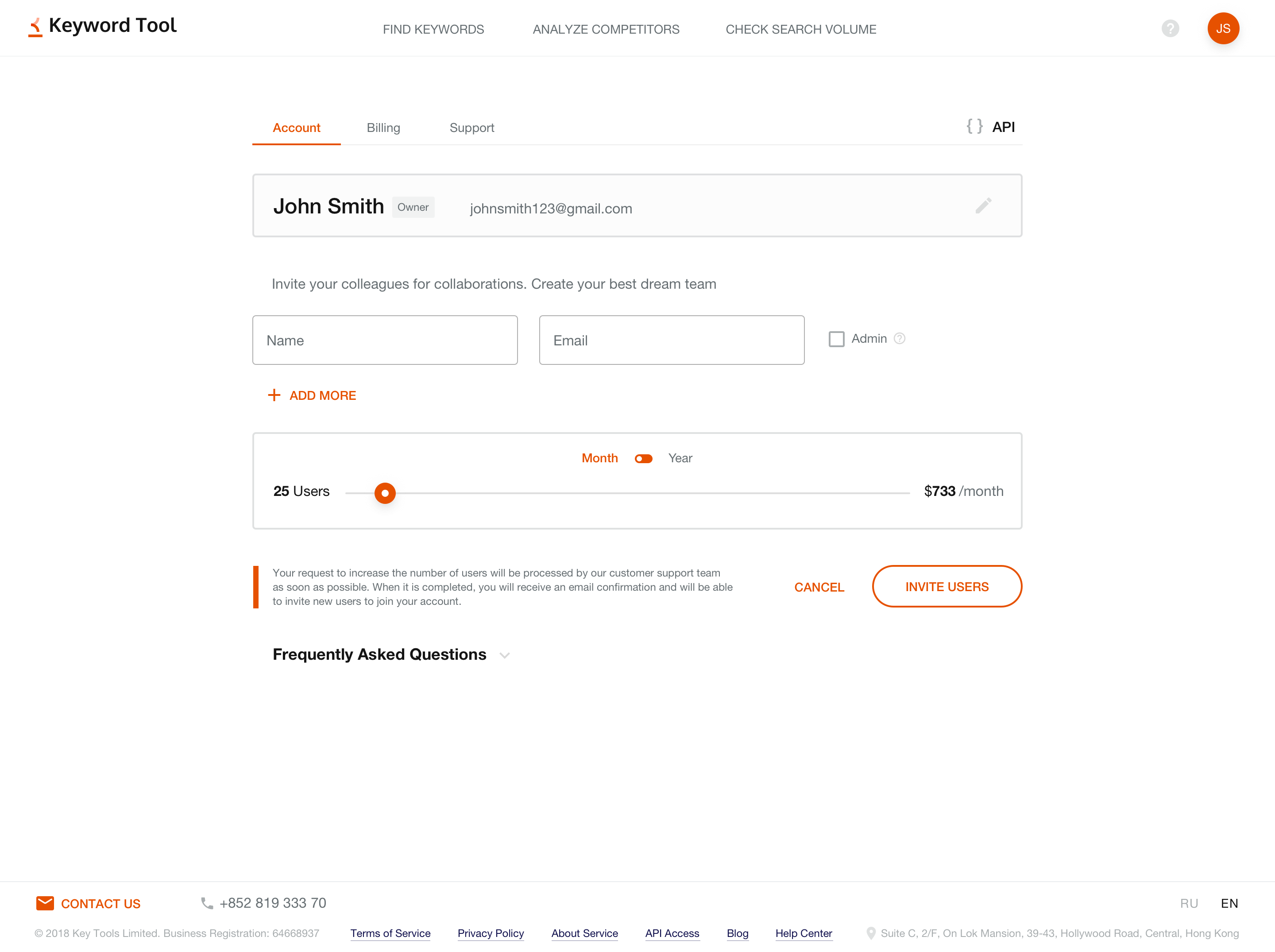
We reorganized the information architecture — grouping tools by how people actually use them, not by how the system stores them. Navigation was restructured so users always know where they are and how to get where they need to go.
We reduced visual noise across the board: fewer competing elements, stronger hierarchy, clearer primary actions. Every screen was evaluated by one question — does this help the user, or just fill space?
Reduced cognitive load. Navigation that users can follow without thinking. A product that finally matches the quality of the data inside it.
The redesign didn't change what Keyword Tool does — it changed how it feels to use it. Less friction, more focus, better decisions faster.
Clarity is a feature.
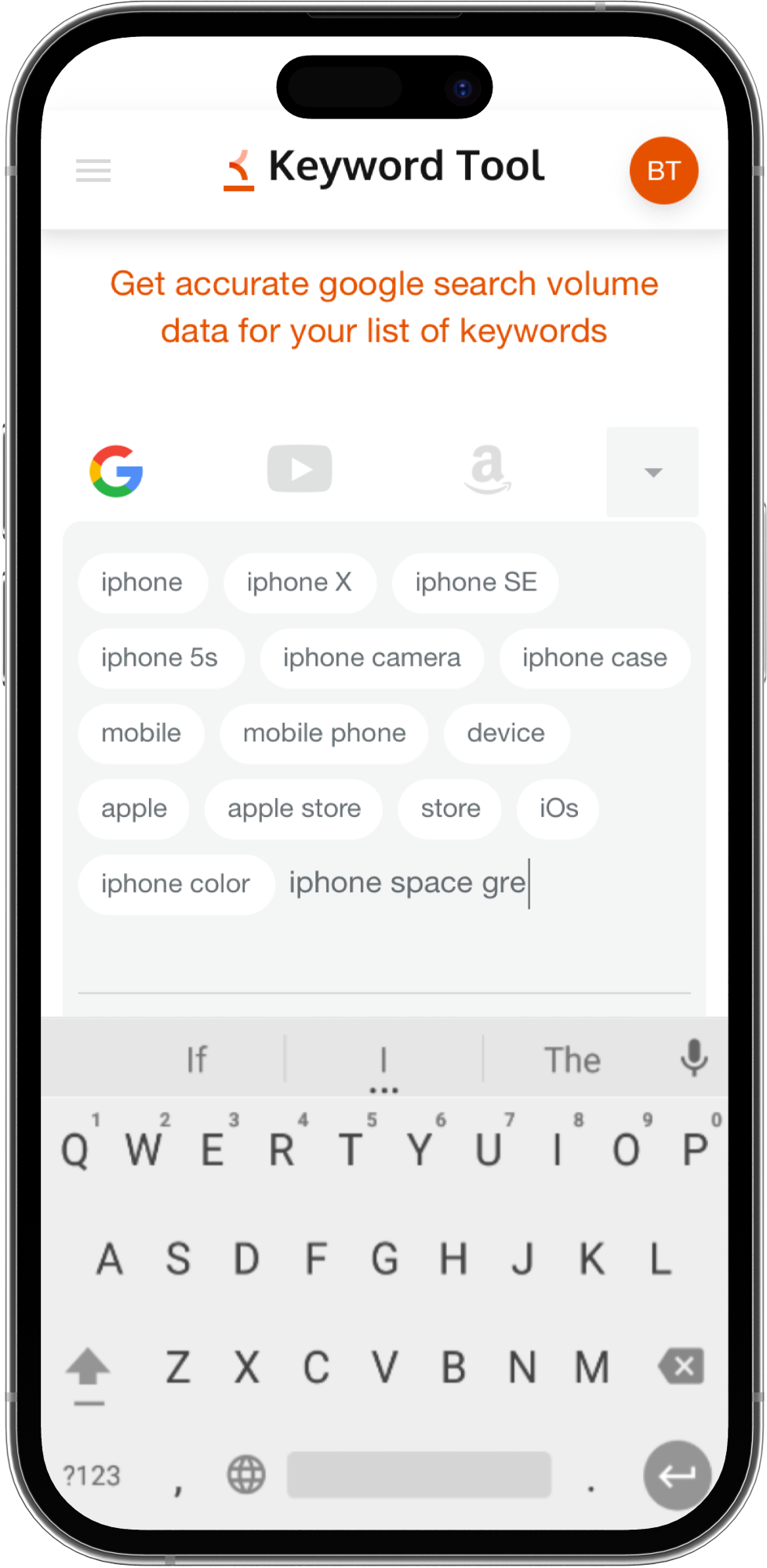
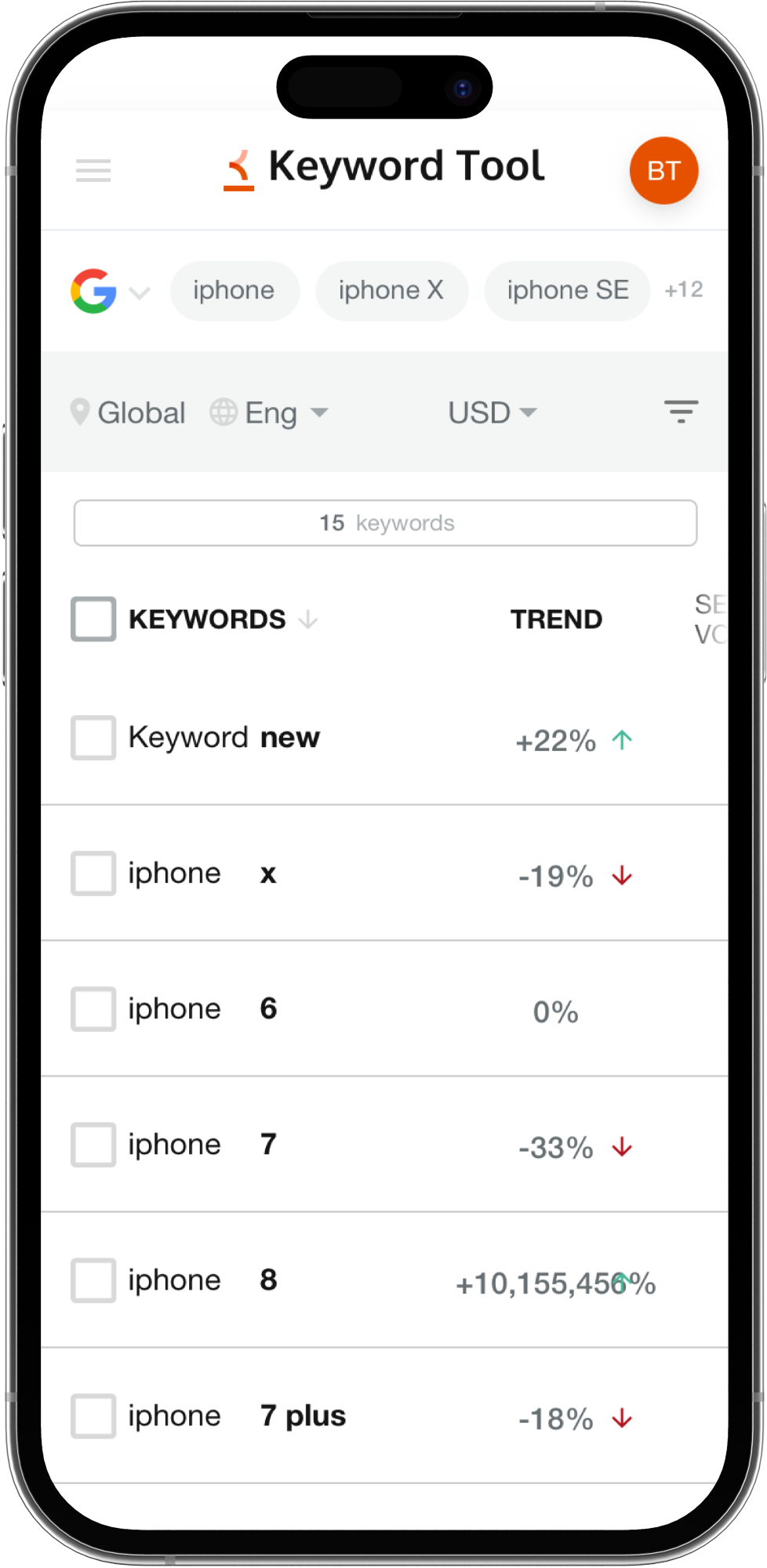
The same logic carried through to mobile — a focused interface built for quick lookups on the go, without the overhead of the full desktop experience.

Artem Galimov
VP of Co-Founder of KeywordTool.io